What’s the difference between responsive and adaptive web design layouts?
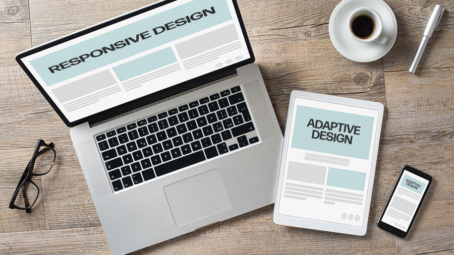
Responsive web design and adaptive web design are two approaches that can be taken when developing a website, to ensure it is optimised for different devices e.g. a mobile, PC, laptop or tablet. Both have the same end goal of ensuring a website can be viewed on various devices without the user experience being compromised, but each uses different methods to achieve it.
Today, the variety of screen size that a user can view a website on is extensive and web designers must take this into account. They must effectively choose between an adaptive web design layout or a responsive one. But what exactly does that mean?
What is adaptive web design?
An adaptive design involves various layouts that can be separately supported on different screens and sizes. Given the number of different screen sizes today, adaptive web design usually focuses on common sizes e.g. 1600px and 1200px to name but two. These templates of the fixed design allow the website to detect the device type and adapt to the appropriate template to fit that specific screen type.
The benefits and disadvantages of adaptive web design
The different designs that are created for different devices can improve the user experience on individual devices. This multiple design feature also means that because a dedicated version will be loaded to the corresponding screen size, loading times are faster. However, this same multiple design feature means that adaptive sites are more labour intensive, and therefore more costly, to create. Maintenance can be problematic too as each version of the site will need to be maintained separately, and, again this leads to more expense for the site owner.
What is responsive web design?
In contrast to adaptive design, responsive web design is fluid, responding to the individual device being used to view the website and involves just one design layout. Put simply, responsive web design layouts respond to the size of screen they are being viewed on. Elements such as text and images optimise to accommodate the browser size leading to a site looking and functioning equally well whether viewed on a mobile or a desktop.
The benefits of responsive web design
Better user experience - Users no longer have to scroll horizontally, when using a small screen device such as a mobile, in order to access hidden content, nor do they have to zoom the page. This easier access to all content will only improve user experience; when a website is easier for users to interact with, they will be less likely to seek out a competitor site. On the flip side, load times can be longer as the fluid nature of the design means page elements have to arrange themselves accordingly.
Increased visibility – The single template nature of a responsive design does away with the duplication of content between versions for different devices, satisfying Google.
More cost effective – as only one design layout is required, the cost to create a responsive web design is less than an adaptive one where several designs are required. Maintenance of a single design site is also easier and cheaper.
Web design and development from TJS Web Design, Lincolnshire
At TJS, we offer a mobile-first responsive web design for all our bespoke websites. The user experience is paramount for us and our clients, and a responsive design layout is the only way to ensure your website will display accurately on all device screens. Responsive sites also occupy higher positions in search engine rankings as preference is normally given to mobile-friendly sites. If you are interested in discussing how our responsive, bespoke web design service can help your business, call us now on 01507 525500.